2025


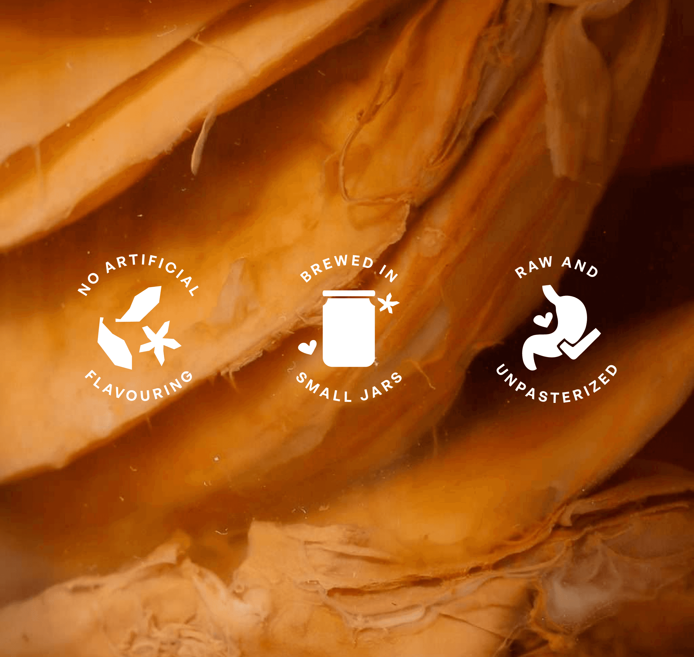
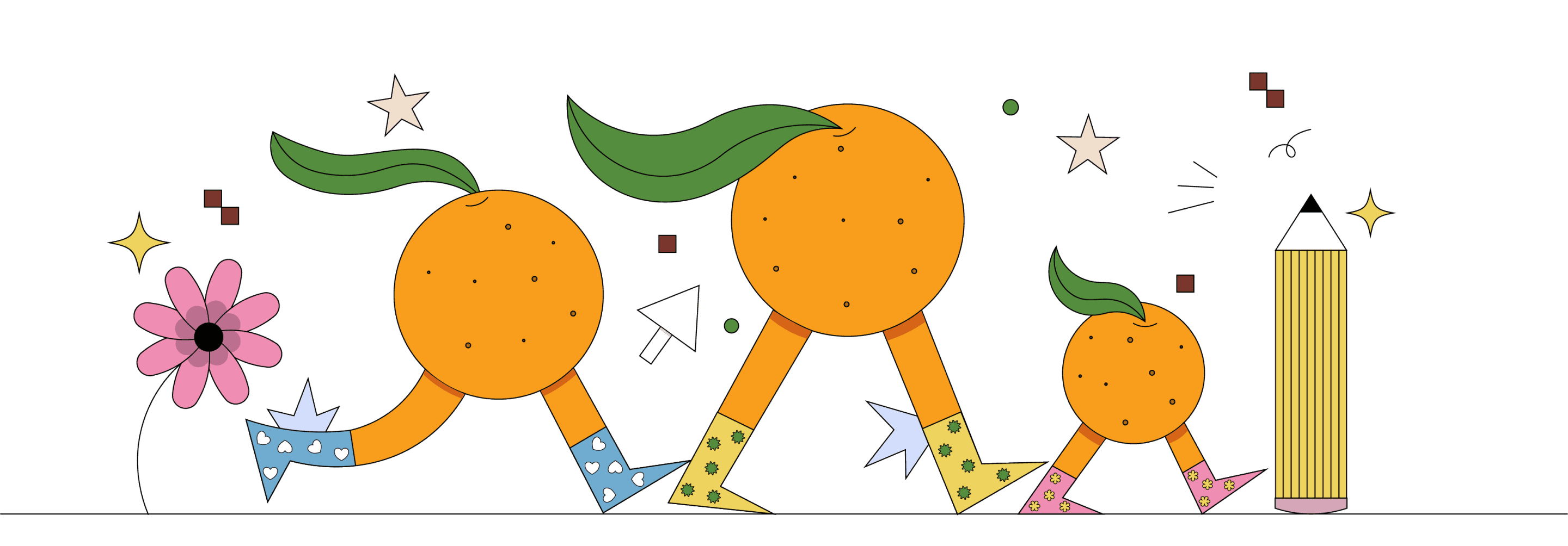
Aurora came to us mid-growth. The original identity read too earnest, too health-functional in a category that was starting to have real fun with itself. They needed a visual language as alive as what's inside the bottle, and our identity for Aurora is as bubbly as its kombucha. The fruits and their abstractness have a lot of personality and we pushed them into shapes that feel familiar before they're fully decoded, forms with motion, with life. The result is a buzzing, relatively unrestrained world for the drinks brand to inhabit. The identity gave the brand the confidence to be in rooms it hadn't been able to walk into before.


Monday to Friday | 10:00am - 6:00pm
Work Locations
Bengaluru & Calcutta, India | Dubai, UAE
© Orange Juice Creative, 2026. All rights reserved.
Open to Projects
Business: hello@orangejuicecreative.com
Career: careers@orangejuicecreative.com